
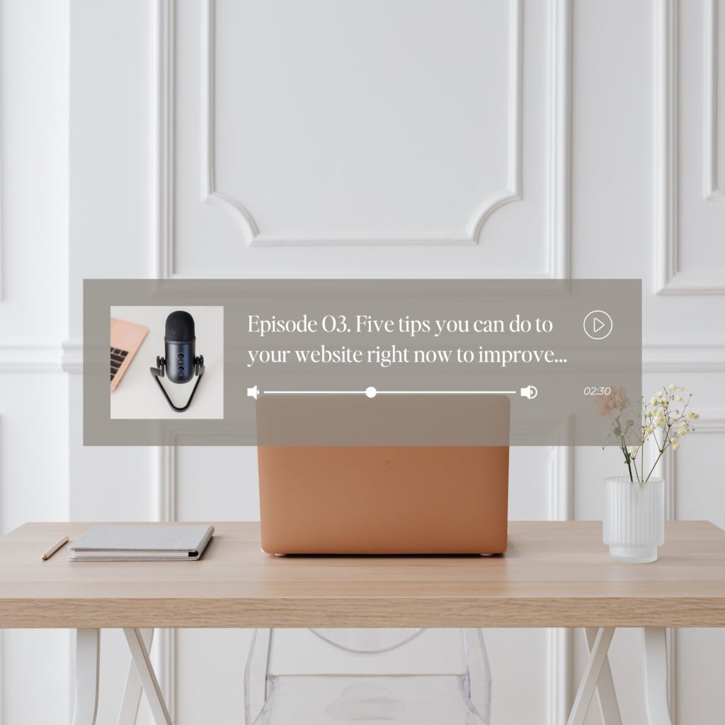
Welcome to episode three. Five tips you can do to your website right now to improve and guide your audience for the best experience. And when I talk about experience, you may not even think my website is an experience, but it really is.
Tip number one – Make your website copy scannable.
What do I mean by making it scannable? So it is so weird how the human brain works. But when we are reading websites, generally speaking, we only read one or two sentences at a time, and we just skim we’re speed reading we’re skimming or going through the website. This is why you want to make your copy scannable, because if someone’s only going to see the first one or two sentences out of a giant paragraph because they are skimming: that scannable copy better be on point and stand out.
The rest of that paragraph is useless to a reader (but not for SEO), so the longer paragraph should reinforce the main topic that is scannable. I see this mistake happen a lot with a lot of different websites. You want the most important information in your titles, headings, and subheadings. And the first one or two paragraphs inside your website.
So you want to start with a heading or subheading? And then you want to follow that with a smaller paragraph.
Tip: You can also use things like bullet points, and check marks; you can use bold or italic fonts to stand out, and help with making it scannable.
Tip number two: The use of white space.
When I say white space, that does not mean it has to be white. It can be any color as long as there is enough space. Now I’m going to get into a little bit of what I call, Showit lingo. Showit lingo is vocabulary that is dedicated to Showit. In Showit your website is built using sections and each section on the website is called a canvas. I like to think of white space as a whole canvas in Showit. The best way to explain the proper use of space it to make sure each canvas is the same height as a screen on a desktop. You want your reader to focus on one section (canvas) at a time so that their attention is only on one area at a time. This gives the reader something to focus on. They will not feel overwhelmed, and you will have enough white space.
Do not run the sections into each other. You have to use enough white space so that when you’re scrolling down, all you see is that section. And you need to avoid running into the top section or the bottom section. Now it’s okay. I do it in some circumstances, like some designs I’ve seen. Example: If there’s an image off to the right or off to the left that’s in between the two canvases, it’s fine because there should be plenty of space around it to where it blends.
Number Three: Help your readers navigate your site with call-to-action buttons.
Telling your readers what to do next with CTA, called-to-action buttons will keep them on your website and provide a good experience because you are helping guide them into what to do next.
A good example is your homepage. It would help if you had sections that represent different areas of your website, such as your about, services, and maybe galleries. Within each section, add a button to take them to the full page to get more information.
Tip about calls-to-actions: One the very bottom of every page on your website, you should have a call-to-action section that takes your reader to the next page or sends them somewhere. If they get to the end of the page and you don’t have anywhere for them to go, they will leave your site. I call that a dead page. Your call to action depends on the website’s goal.
Number four – Offer a freebie.
If you want your clients to have a good experience and have that experience start, you can offer them a freebie. That can be anything. I don’t recommend just having them sign up for your email list in general because that just says, Hey, spam me. You need to have value and offer something to start building trust. Something educational works very well. If you want to get started with email marketing, you can head over to my freebie and download five email templates that will help you build your email list. You can grab that here.
Tip Number Five – Add your email address to your contact page.
This tip sounds obvious, but if you have a third-party form embedded on your site or a built-in contact form, and it becomes broken for whatever reason. How is someone going to contact you? They can’t unless you add your email address.
So there you have it. My top five tips for a great website experince for you vistors.


