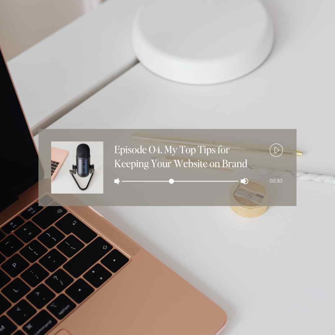

In episode four, I am passionate about keeping your website on brand since my business name is Brand Me Gorgeous. I will go through some of the different things I do when I am either building a custom website or building a template that keeps a website on brand.
Diving right in at number one is the use of your brand photos.
And I know. Some of y’all may say, Ugh, I don’t like looking at myself. I don’t want my website to be plastered with photos of just me all over it, but I promise you that is the number one way you will be able to build that connection with your audience.
Your audience would want to see photos of yourself versus stock photos. And trust me; I am my own worst critic. We all are our own—worst critic here when it comes to this. And I can’t tell you how many times. I am building a website or even for myself doing my own website. I am like; I think I’m going to swap out that photo of myself with a stock photo. And then I’m like, wait, hold up. Nope, I can’t do that.
Somebody is going to look at that photo of me and not think nearly as badly about that photo as what I do myself. And that’s also something I must tell clients because if I’m building a mock-up of their site or editing the site, whatever the case may be. And there’s a stock photo; then I’m telling them, okay, let’s replace the stock photo with an image of you. And they’d be like, why. I don’t want pictures of me all over my website. So I’m like, yeah, you do. I promise you. And I’m not talking about every photo; that’s not what I mean. But if there is a spot where it does match, and it will go well with that website section, you want to put a photo of yourself or your products. Whatever it is about your brand, even if you have a location and a picture of the outside of your business, something to give them that visual of exactly what it is that you do, where you do it, and what you offer. All those things will be a hundred percent better in a brand photo versus a stock image.
Number two is the use of your logo.
Brand designers are very good at giving a primary logo, a sub-logo, and different logo variations to represent your brand. And when you’re building a website, it’s helpful to use different variations of that logo in different areas of the website.
One of the things I do is to put that primary logo on the website’s header where the menu goes. And then towards the end, at the bottom in the footer, that’s where I’ll put in the sub logo. I also like to put a logo on the side of an image or even as a background for a section on the website.
Number three is the use of your brand colors.
It’s obvious that your brand colors are going to be used in your website. Right? But there are a few little tricks that you can do that help even more. One of them will be when it comes to your font and how you utilize your colors with your font. In the last episode, I spoke about ways that you could break up your copy to make sure that it’s readable and scannable for your audience. And this is one of those ways that you can break up your text. You can have a section on a website with a heading and subheading. It could even have a title or a paragraph. And you can pick one of those sentences or statements you can put in color. One word or statement could be colored to make it stand out. This also helps with making it scannable and readable.
My last tip for color is to use it for the background color, but I often do not use the exact color; instead, I will use a brand color and lower the opacity to 20 or 30 percent. That is the sweet spot for just enough color to keep everything on brand without the website looking too over the top with color if that’s not the brand vibe.
The last tip for keeping a website on brand is using your brand’s voice.
I am sure you have heard it before about using your brand voice. But I feel it is often perceived and described by using labels. Instead, I refer to it as just using your brand voice. In your day-to-day life while talking with family, friends, and co-workers, there are sayings, phrases, and a tone that is all you. That is the same as a brand voice. It is you. Feel free to write down those saying you use and add them to your website if it flows to give your brand voice.
Believe it or not, I cuss like a sailor, but I don’t use it in my brand. It’s not part of my brand or business because I know that’s not professional. And it does work for some people. Some people feel comfortable throwing the f-bomb out or profanity, whatever it is that you want to call it, into their website. And I don’t mind that, even when I come across a brand like that. And that’s because it does resonate with me. It’s a personal choice, and everyone has their brand voice and tone.
That wraps up what I talked about in episode 4 if you have questions or want me to cover a topic, head on to my podcast page and fill out the form.


